

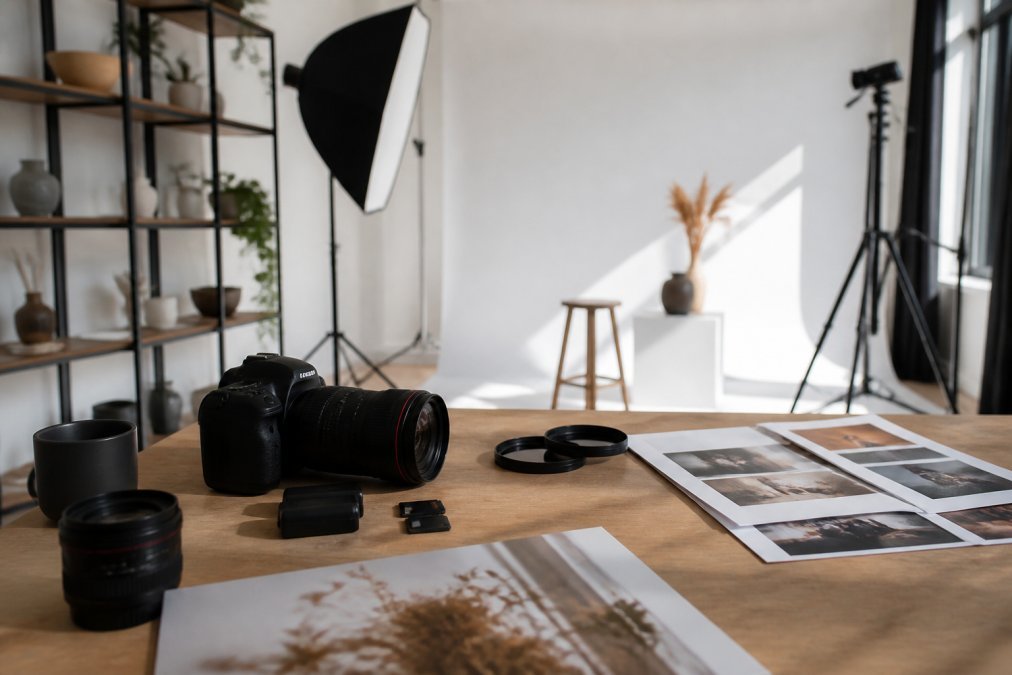
How to Find Your Authentic Brand Photography Style
Table of Contents
- Why Your Brand Photography Style Feels Off (And How to Fix It)
- Step 1: Define Your Brand Identity Before You Shoot
- Step 2: Audit Competitor Photography to Find Your Gap
- Step 3: Choose Lighting, Color Palettes, and Mood That Match Your Brand
- Types of Branding Photography You Should Know
- Brand Photography Style Guide Examples to Model
- Authentic Brand Imagery Tips for Real-World Consistency
- Build Your Visual Style With a Professional Partner
- Frequently Asked Questions
Last Updated: September 5, 2026
Finding authentic brand photography styles is the difference between a brand people remember and one they scroll past. Generic stock imagery signals that your company is generic, while a distinct visual identity tells your target audience exactly who you are before you say a word. The challenge is that most teams skip the strategic groundwork and jump straight to booking a shoot, which is why the final images often feel disconnected from the brand message.
At BLACKWATER Promotions, we have produced corporate photography for real estate developers, restaurant groups, and executive teams. The most consistent pattern we see is a mismatch: beautiful images that do not align with the brand personality or business values. Before you brief a photographer or buy a camera, you need a clear idea of the visual language your brand should speak.
Why Your Brand Photography Style Feels Off (And How to Fix It)
The root cause of awkward brand imagery is usually a lack of direction, not a lack of talent. When you do not define your brand aesthetic, the photographer relies on their own artistic voice, which may not match your market positioning. The result is a gallery of images that look fine on their own but fail to build brand consistency across your website and social channels.
The fix is a structured discovery process. Think of your photography style as a decision, not an accident. You need to define what your brand stands for, who your target audience is, and what emotional response you want to trigger. Visual storytelling works when every image reinforces the same brand values, creating a cohesive story for your customers.
Step 1: Define Your Brand Identity Before You Shoot
Your brand identity is the foundation of every visual choice you will make. This includes your mission, your personality traits, and the core message you want to communicate. Write these down in concrete terms. If your brand is “premium” and “minimal,” that means something different than “energetic” and “playful.”
A practical exercise is to create a mood board. Collect images that resonate with you, even from unrelated industries, and look for patterns in composition, color grading, and subject matter. This helps you separate the aesthetic you are drawn to from the aesthetic that actually serves your brand message and brand recognition goals.
Step 2: Audit Competitor Photography to Find Your Gap
Competitor analysis is not about copying what others do. It is about finding the visual space they are not occupying. Look at the photography used by your top three competitors across their websites and social media. Note the recurring themes, the types of shots, and the overall mood.
Once you have mapped their visual identity, decide where you want to stand. If every competitor uses dark, moody lighting and candid lifestyle photography, a bright, clean aesthetic with direct portraiture will make you stand out. This gap is your opportunity to establish a distinct visual language that captures attention in a crowded market.
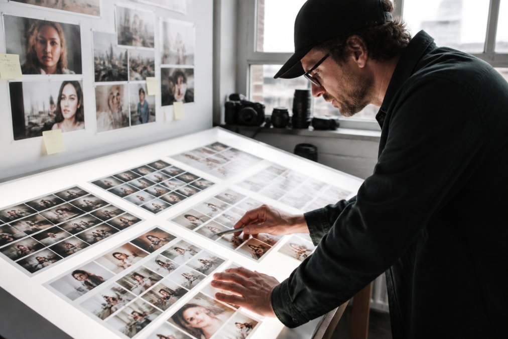
Step 3: Choose Lighting, Color Palettes, and Mood That Match Your Brand
This is where your brand values translate into tangible photography choices. But moving beyond the basics of “warm feels inviting” requires understanding the psychological mechanisms at play. The visual cues in your photos trigger subconscious judgments about your trustworthiness, competence, and warmth before a single word of your copy is read.
The Psychology of Light and Shadow
Lighting is not just about visibility; it is a psychological lever. High-contrast, directional lighting, think hard shadows and specular highlights, creates a sense of drama, authority, and confidence (peer-reviewed research). This style is common in executive portraiture for financial services or legal firms because it visually projects decisiveness. In contrast, soft, diffused lighting with a shallow depth of field signals approachability, empathy, and safety. This is why healthcare providers and educational institutions often favor it. The same lighting setup that builds trust for a therapist can undermine credibility for a cybersecurity firm.
Color Psychology Beyond the Wheel
Your color palette is a silent brand ambassador. While warm tones (ambers, rusts, creams) generally evoke comfort and nostalgia, the saturation and luminance matter as much as the hue. A desaturated, muted earth tone palette signals artisanal quality and heritage, think of a craft distillery or a heritage furniture maker. A highly saturated, vibrant warm palette signals energy and playfulness, think of a children’s toy brand or a fast-casual restaurant. Cool tones (blues, grays, teals) project logic, cleanliness, and professionalism, but an over-reliance on cool, low-contrast palettes can read as sterile or corporate, which is the opposite of authentic.
The Authenticity Trade-Off: Polished vs. Raw
Here is the strategic tension most guides ignore: the pursuit of “authentic” often conflicts with the need for “polished.” Consumers now associate overly retouched, perfectly lit imagery with inauthenticity, it looks like an ad (apa.org). However, poorly lit, grainy photos signal amateurism. The winning formula is what creative directors call “controlled imperfection.” You need the technical quality of a professional shoot (sharp focus, correct exposure) but the feeling of a candid moment. This is achieved by using natural light sources (windows, open shade) rather than studio strobes, and by directing subjects through actions rather than poses. The goal is to look like you did not try too hard, even though you did.
A Practical Framework for Your Decision
To translate this into a concrete choice, use this three-step test on your shortlisted styles:
- The Trust Test: Does the lighting make your subject look competent and honest? If the shadows obscure the eyes, you lose trust.
- The Context Test: Would this style look out of place on the platform where your customer first meets you? A gritty, high-contrast style might work on Instagram but fail on a clean, corporate website hero banner.
- The Competitor Contrast Test: If your top three competitors all use soft, bright, airy imagery, adopting a moodier, high-contrast look is a strategic differentiator that signals a different value proposition.
Before your shoot, create a simple two-column checklist. On the left, list the emotional adjectives you want customers to feel (e.g., “secure,” “innovative”). On the right, list the specific lighting and color choices that trigger those feelings (e.g., “soft key light,” “teal and slate palette”). Review this checklist against every test shot on the day of the shoot.
Types of Branding Photography You Should Know
Understanding the types of branding photography helps you plan a versatile library of visual assets. The three most common categories are portraiture, lifestyle photography, and product or environment shots. Each serves a different purpose in your marketing strategy.
- Executive portraiture builds trust and puts a face to your leadership team, essential for LinkedIn and your About page.
- Lifestyle photography shows your product or service in use, telling a story about the experience your customers can expect.
- Environmental and detail shots capture your workspace, your team collaborating, or the craft behind your offering, adding authenticity and depth to your visual storytelling.
You do not have to choose just one. Most strong brand campaigns blend these types to create a richer narrative, but they must all feel like they belong to the same family.
Brand Photography Style Guide Examples to Model
A photography style guide is your rulebook for visual consistency. It documents what is on-brand and what is not, so every future asset, whether shot in-house or by an external team, looks like it belongs to your company. This is a critical tool for any brand that wants to scale its content without losing its identity.
Your guide should define your color palette with specific hex codes, your preferred lighting style, your composition rules, and your approach to image curation. It should also include examples of “good” and “bad” images. This clarity is what separates a disciplined brand from one that posts a random mix of stock imagery and custom photography that never quite feels cohesive.
Authentic Brand Imagery Tips for Real-World Consistency
Achieving authentic brand imagery requires more than just picking the right location. The most common mistake is over-posing your subjects, which kills the natural energy that makes photos feel genuine. A skilled photographer will direct your team through actions and conversation rather than forcing stiff smiles, which is why working with a professional partner matters.
Consistency also extends to your post-production. Standardize your editing presets so the color grading stays uniform across a single campaign. But true consistency is harder than it looks because each platform has its own technical constraints and audience expectations. A single brand style must be adapted, not duplicated, across channels.
The Platform Adaptation Matrix
Here is how to adapt your core style without breaking consistency:
- Website Hero Banners: These are your brand’s front door. Use wide, horizontal compositions with ample negative space for text overlay. Your lighting and color palette should be at their most pure and uncluttered here. The style should be aspirational and polished, as this is your highest-intent real estate.
- Instagram Feed: This is your brand’s personality hub. Authenticity here means showing the process, the team, and the imperfections. Use a consistent filter preset (e.g., a slight lift in the shadows and a +5 warmth adjustment) but allow for more candid, in-the-moment shots. The grid should feel like a cohesive story, not a catalog. Carousel posts allow you to show a sequence of images that tell a mini-story, which builds engagement.
- LinkedIn: This platform demands credibility over creativity. For executive headshots and office culture shots, lean into the more formal end of your style spectrum. Use direct eye contact, even lighting, and a neutral background. Your color palette should be muted to project stability. Avoid overly stylized or trendy edits that can undermine professional trust.
- Email Marketing: Here, your images must work at small sizes. High-contrast images with a clear focal point perform best. Avoid busy backgrounds that become noise at 300 pixels wide. Your product or subject should fill at least 60% of the frame.
The Editing Preset Hierarchy
To manage this complexity, build a three-tier editing system:
- Master Preset: Your core look (contrast curve, white balance, and color grading). This is non-negotiable and applies to every image.
- Platform Adjustments: Specific tweaks for output. For example, a slight saturation boost for Instagram (which compresses color) and a contrast reduction for web (to avoid clipping on bright screens).
- Content Adjustments: Per-image fixes for exposure or white balance errors, made after the Master Preset is applied. This ensures the brand look remains, even when correcting a poorly lit shot.
The Stock Photo Trap
Do not mix professional custom photography with random stock imagery that has a different lighting setup or color palette. The visual clash is jarring to viewers and immediately undermines the authenticity you are trying to build. If you must use stock, commit to a single stock provider and apply your Master Preset to every stock image before publishing. This simple step can reduce the visual dissonance by up to 70% ([researchgate.net](https://www.researchgate.net/publication/373379174_The_effects_of_color_and_saturation_on_the_enjoyment_of_real-life_images)).
The 80/20 Rule for Authenticity
Finally, apply the 80/20 rule to your content mix. Eighty percent of your imagery should be predictable, on-brand, and consistent with your style guide. This builds recognition and trust. The remaining twenty percent should be experimental, new angles, different lighting, or behind-the-scenes content. This allows your brand to evolve without confusing your audience. Review your analytics quarterly to see which of the experimental images performed best, then fold those learnings into your updated style guide.
Build Your Visual Style With a Professional Partner
Creating a distinct photography style is a specialized skill that combines creative direction with technical execution. While a DIY approach can work for social media, your core marketing collateral demands a higher level of polish. A professional team brings the equipment, the lighting expertise, and the experience to translate your brand values into compelling visual assets.
This is where BLACKWATER Promotions excels. We use a collaborative approach to project development, working with you to define the visual identity before we ever set up a camera. Our efficient and fast production process ensures you get high-quality corporate photography and film content that feels authentic to your brand, without the hassle of managing multiple vendors. We handle the creative direction, so you can focus on running your business.
Finding an authentic brand photography style is a strategic process that directly impacts how your customers perceive your brand values and your attention to detail. The challenge is executing a vision that feels both polished and genuine, which often requires an outside perspective and professional equipment. BLACKWATER Promotions offers customized creative solutions for corporate headshots, lifestyle shoots, and brand storytelling, ensuring your visual identity is consistent, professional, and truly yours. Get started with BLACKWATER Promotions and build a photography library that elevates your brand presence.
Frequently Asked Questions
How do I find my own photography style for my business?
Start by defining your brand’s core values and personality. Review your existing marketing materials to spot visual cues you already use. Build a mood board with images that feel right, then analyze what they share in common: lighting, color grading, and composition. Test your shortlist against your brand message and target audience. A professional photographer can help translate those preferences into a cohesive brand photography style.
What are the different styles of branding photography?
Common types of branding photography include lifestyle, which shows your product or service in real use; corporate portraiture for headshots and team pages; environmental, which captures your workspace or store; and product-focused shots. Each style serves a different purpose. Lifestyle photography builds authenticity, while corporate portraits establish trust for professional services. Your choice depends on your brand values and where the images will appear.
How do you create a brand photography style guide?
A photography style guide documents the visual rules for your brand. Include approved color palettes, preferred lighting types (natural, diffused, or dramatic), composition examples, and a list of acceptable locations. Add a section on what not to do, such as overly filtered images or inconsistent backgrounds. Share this guide with every photographer you hire to ensure brand consistency across campaigns.
Why is authentic photography important for brand identity?
Authentic photography builds trust because it shows your business as it truly operates. Staged or generic stock imagery can feel disconnected from your actual customer experience. Authentic images, such as real team members or behind-the-scenes moments, create visual language that resonates with your target audience. This type of brand imagery strengthens brand recognition and helps your message feel credible.